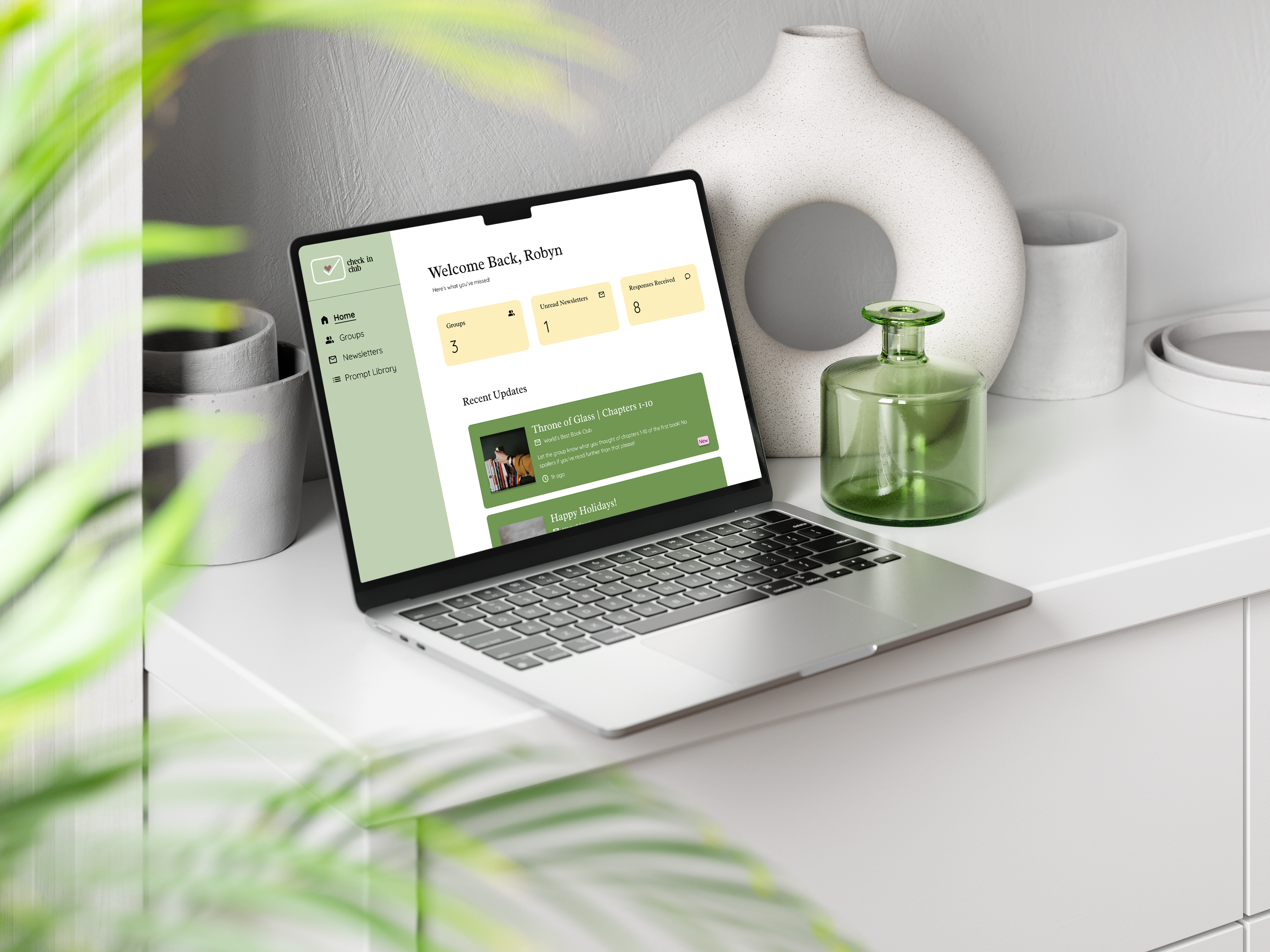
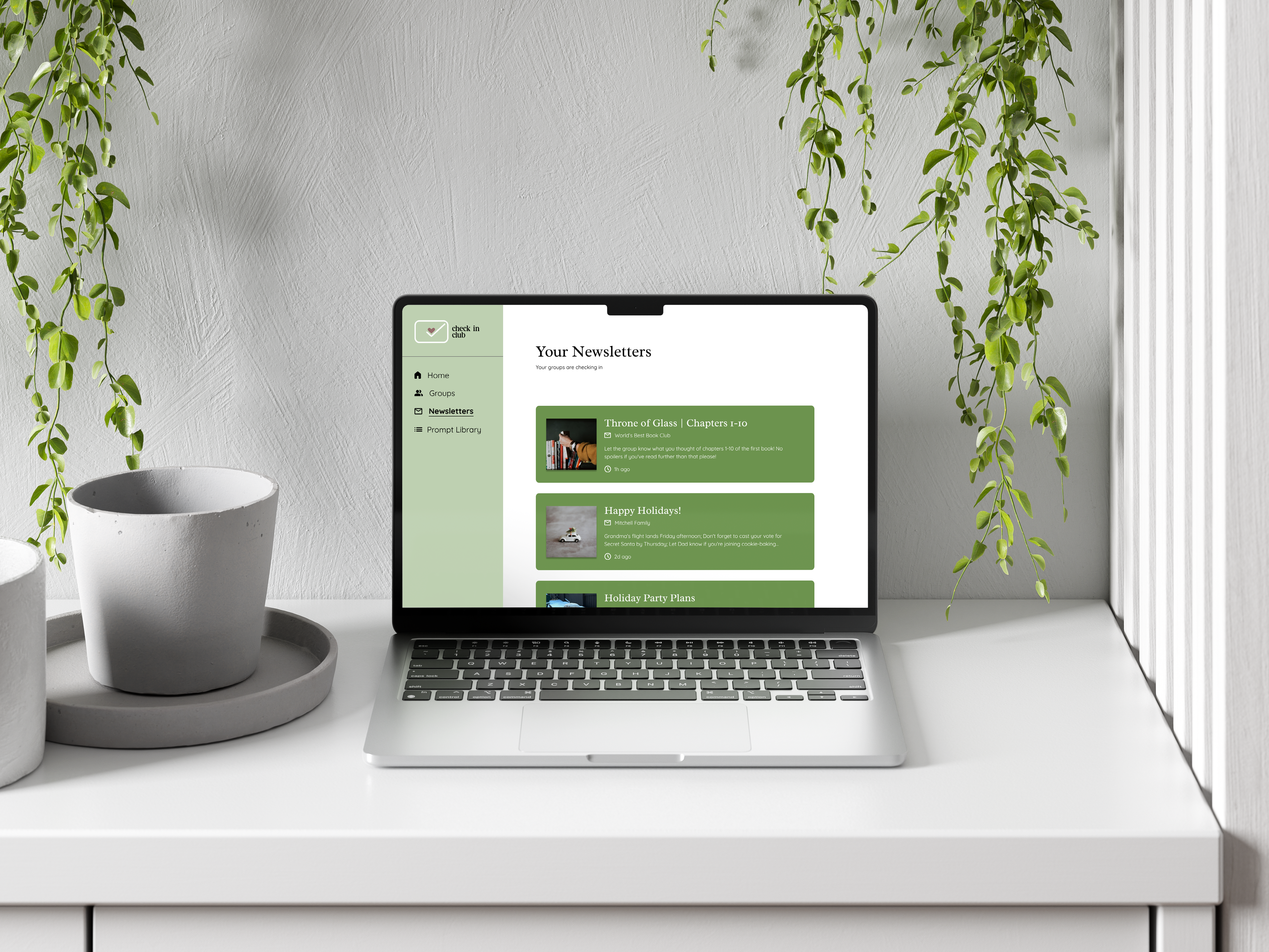
My team and I developed Check In Club, a website that helps people stay
connected with their loved ones through shared, guided check-ins. Users
join private groups, respond to curated prompts, and receive a beautifully
formatted email compiling everyone's responses in one place.
My contributions
included researching how people communicate with those closest to them,
shaping the user experience, and prototyping the final designs for presentation
in our Design Studio I course. This project was presented at CapCon, as part of our final semester Capstone course.
Problem: Existing communication tools make it difficult for users to maintain meaningful connections with loved ones across distance, time zones, and platforms. How might we reduce the effort and friction required to help people regularly stay connected with their loved ones, even when separated by distance, schedules, and differing communication habits?
Solution: Design a web platform that facilitates meaningful connections. Ensure that it is accessible to users of all ages, and makes sharing their lives & stories easier.
Impact: We brought Check In Club from concept to a live website and presented it at CapCon, SAIT's Capstone showcase, clearly communicating the platform's purpose and vision to an audience of peers and industry guests.
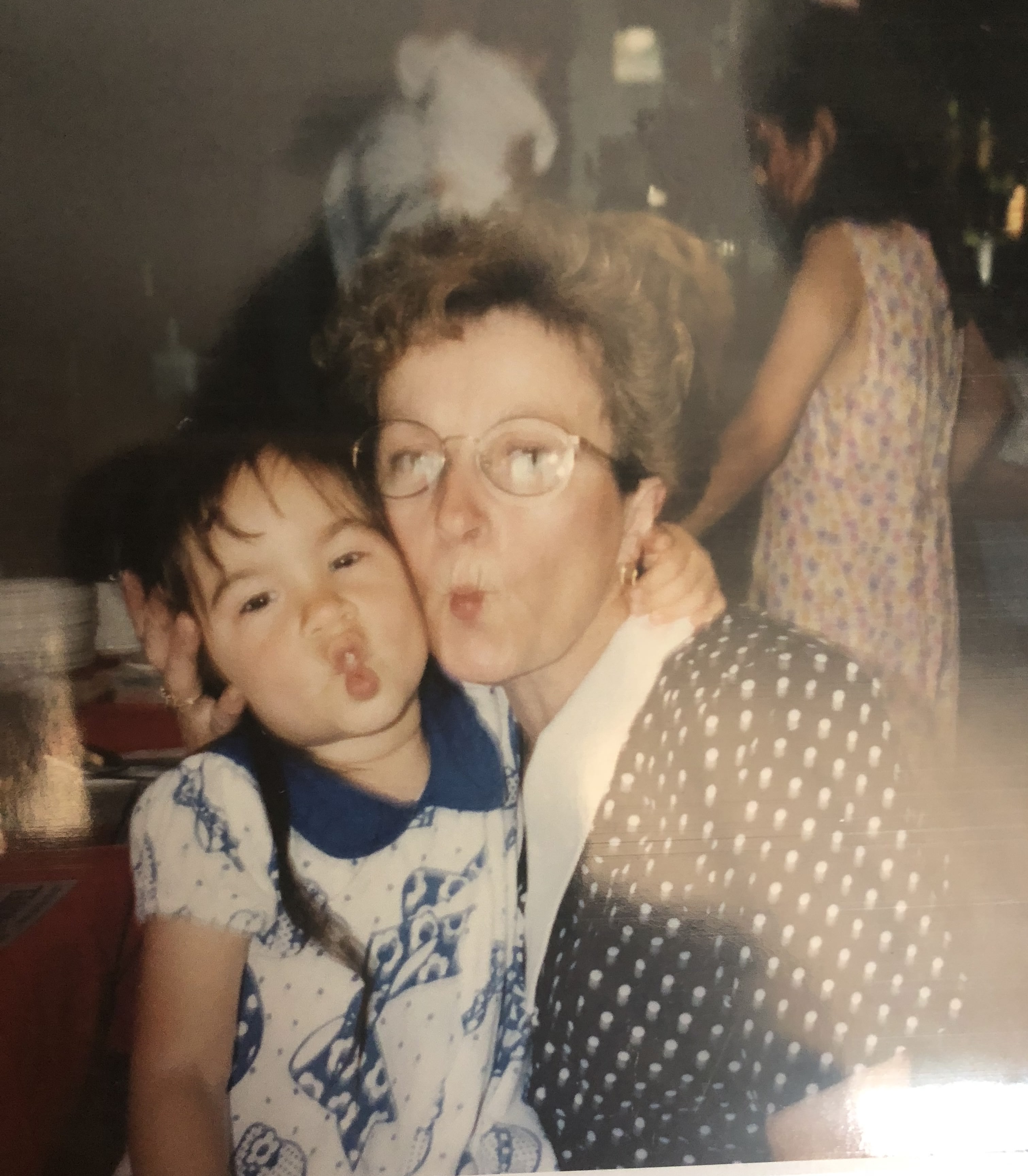
In my family, everyone talks to my grandma first. She's the one who knows what everyone is up to, even when we don't talk often. I started wondering what it would look like if that shared knowledge could be captured and passed along - without relying on social media or constant check-ins. That idea became the foundation for Check In Club.
To better understand the problem space, we began by analyzing direct competitors and conducting a survey with 20 respondents. From this research, several key insights emerged:
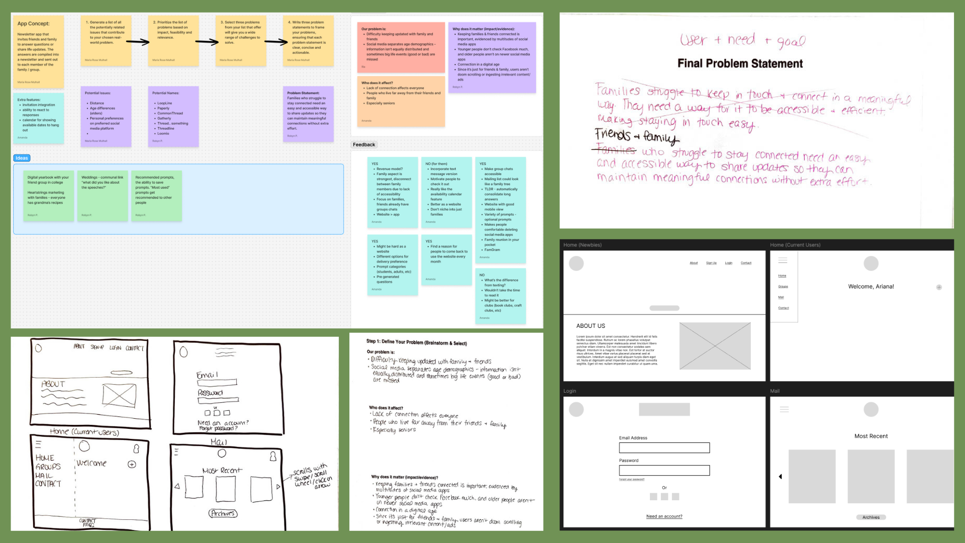
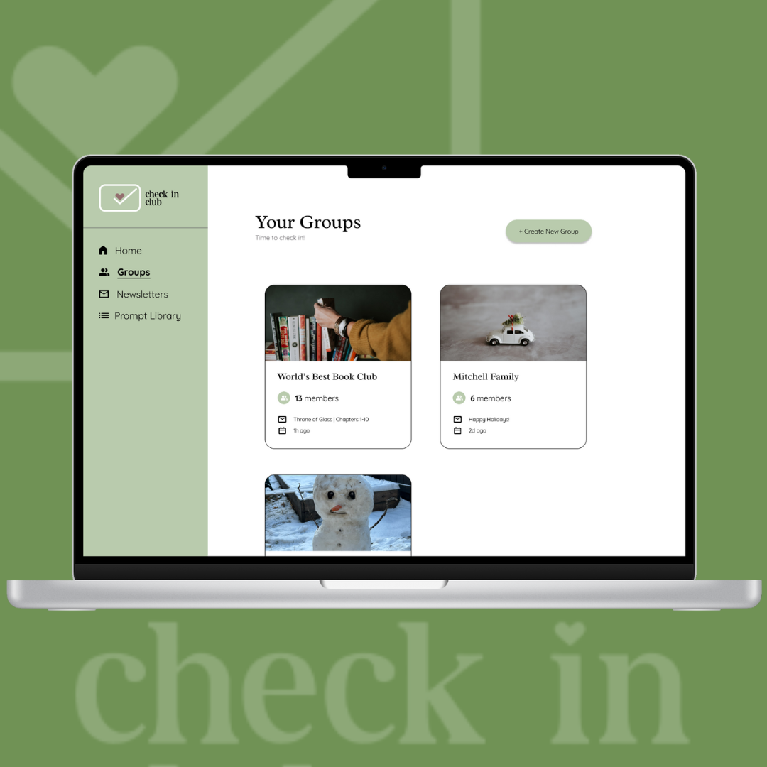
Prototyped a platform with a simple information architecture that is easy to navigate for users of all ages
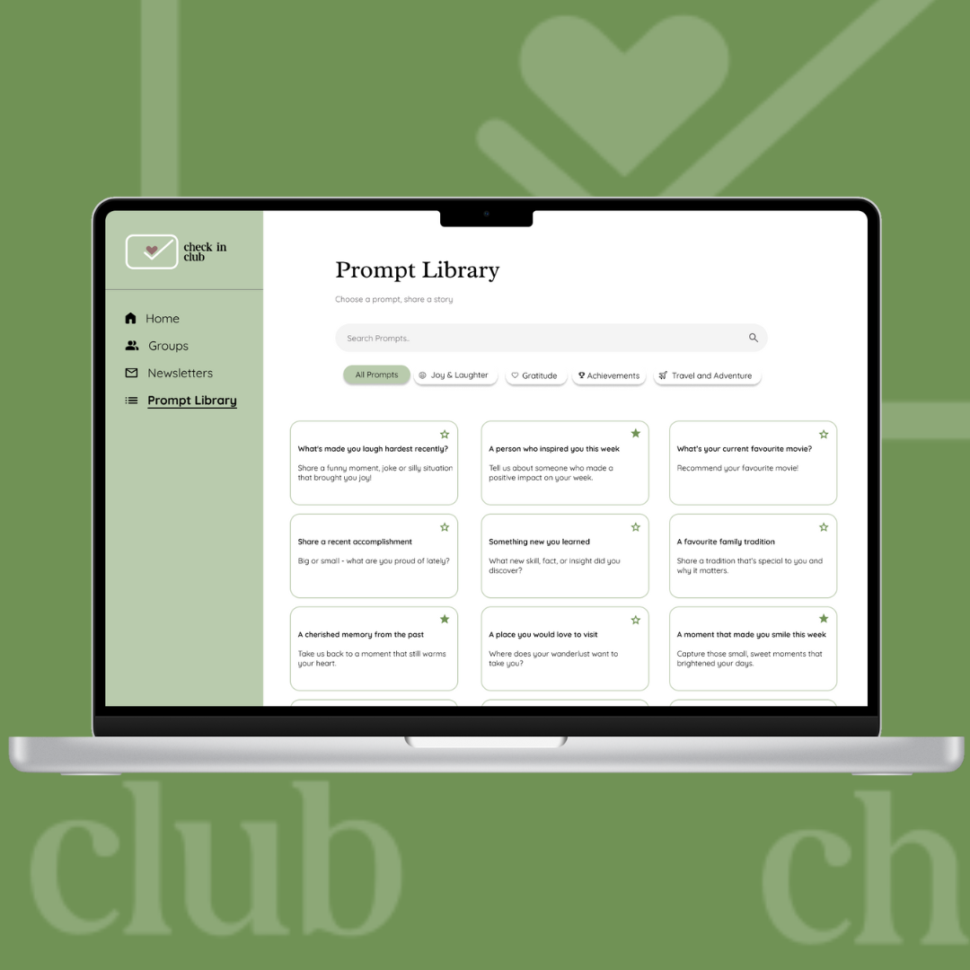
Prototyped a robust prompt library, with options to save favorite prompts
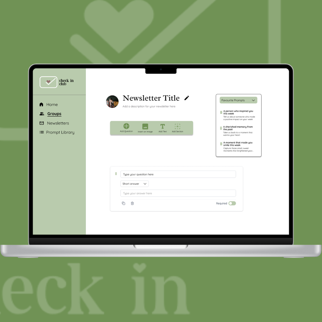
Ensured users were able to add images while creating newsletters
Prototype & User-Test Earlier
Due to the tight timelines of the course, our team had limited time to iterate on and refine our prototypes, which resulted in a more condensed finalization phase. As a result, we were unable to conduct user testing on the final version of the product, leaving some uncertainty around how fully the solution met our original goals.
Research, Research, Research
As new design students, we initially underestimated the importance of rigorous research. While we did gather early feedback, much of it was high-level and overwhelmingly positive, often focused on excitement around seeing the product completed. This limited the depth of insight needed to fully validate our design decisions, resulting in a solution that relied more on intuition than evidence.
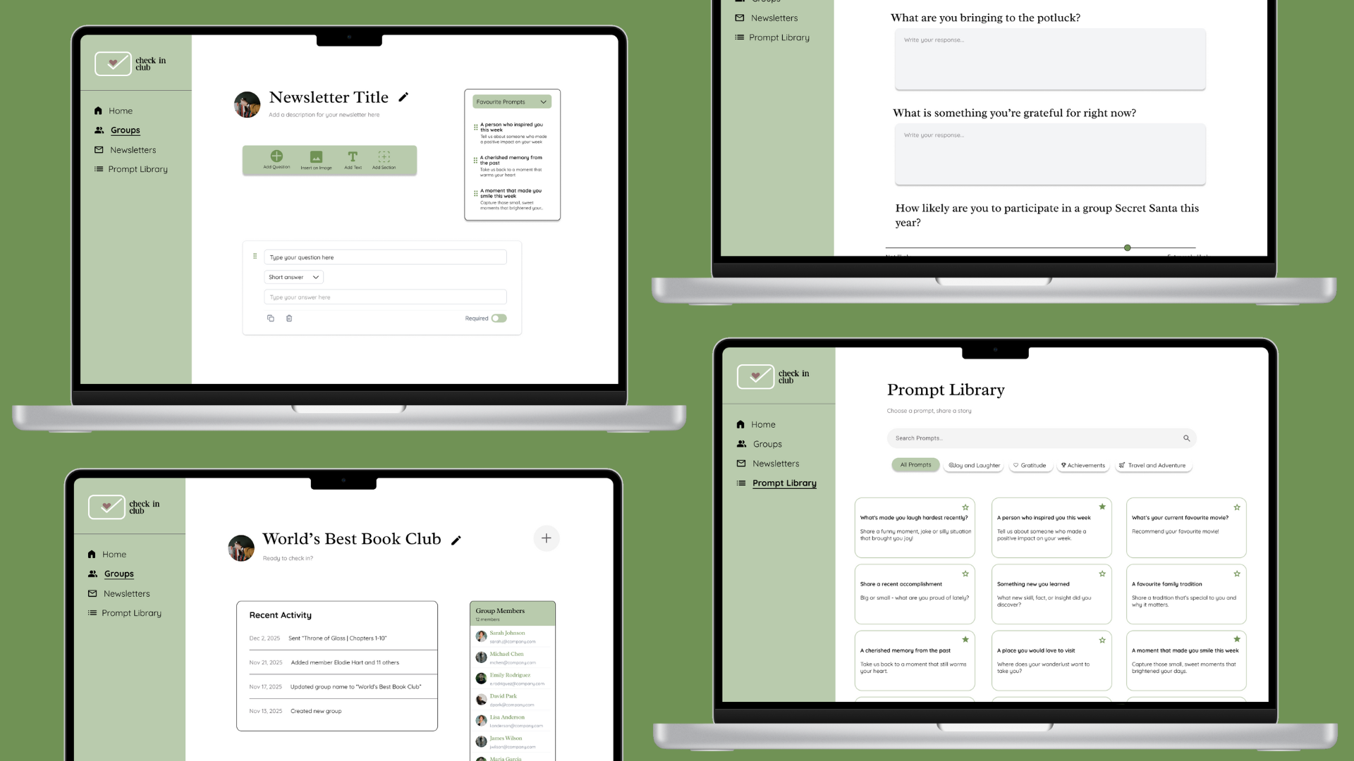
For our final semester Capstone, my team took Check In Club from prototype to a live website, which we presented at CapCon, SAIT's showcase event for Capstone students. Early in development, we realized that building out the full platform wasn't realistic within our timeline, so we made the call to focus on the customer-facing side of the site. This gave visitors a clear picture of what Check In Club is, who it's for, and the problem we set out to solve.
Scoping the project down was one of the most valuable lessons of the Capstone. It pushed us to prioritize what mattered most for our audience and to communicate a bigger vision through a smaller, finished piece of work. While we didn't build out the full platform, the project taught me how to make practical trade-offs under a deadline, and how important it is to define scope early so the team can focus on delivering something polished.